This site was funded by

Introduction
It is vitally important that all students can access all teaching material.
This section aims to answer the following questions:
- How can we ensure students can access teaching material?
- What should teaching material look like? What aesthetic considerations might make material more or less accessible?
- How can we check that material we have produced is accessible?
Access to teaching materials
Reading lists and required reading
There are a number of factors that need to be considered to enable staff to produce accessible material. Firstly we need to consider how students will access teaching material.
Orr et al. (2009), quoting Hill (1995) and Madaus et al. (2003) found that one of the most common barriers students reported were delays in getting access to course readings. Similarly, Brandt (2011) reported that a problem frequently identified by students was getting the study materials they required adapted into an accessible format in time for classes and exams, so we need to choose teaching material such as set texts and references in reading lists that are available in both paper and electronic form.
A student with a visual impairment is likely to require much larger text than would normally be produced, possibly up to font size 48. Individuals who can’t see text at font size 48 will be braille or screen reader users. Some braille users will have hardware that can produce braille from electronic text, but this is time consuming, so will need to be provided with material at least 48 hours in advance. This will also help non-native speakers who need to familiarise themselves with new terminology before a class as well as students with Specific Learning Differences who can find it difficult to absorb large amount of text quickly. Similarly, if you have to produce an exam paper for a braille user you are likely to have to produce the paper in advance of the normal deadline.
If a set text or essential reading is not available electronically try to provide the reading list well in advance of the start of the module because the student, library or disability services, will need to either negotiate with the publishers to obtain an electronic version or get the text translated into an accessible format. All of this can be time consuming.
Accessible formats
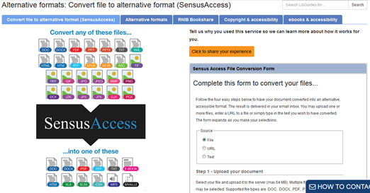
The University now has SensusAccess. This is resource enables a wide variety of file formats, including docx, pdf, ppt, html and jpeg, to be converted into more accessible formats such as txt, mp3 and braille. This resource can be found by clicking here.
In my survey of Exeter students I found that some students find paper copies more accessible, while others can only access electronic versions of text.
Student quote:
“[I] can’t concentrate on words on a screen. Is easier when printed … Put all the books needed in the library. We are expected to print lots of resources which is very expensive. Provide hard copies of texts needed”.
Students also reported that in some cases set texts were not available in the library at all and that accessing the library itself can be problematic. A student with Asperger’s said:
Student quote:
“I find it difficult to get stuff from the library because of the number of people there. The [construction] works around campus make it harder to access it due to funnelling people. I would be fine with e-books if I could download them, although it is also harder to read on the computer.”
Depending upon a student’s impairment, some types of teaching resources may not be accessible. For example, some students will prefer hard copies of documents while others may need material electronically so that it can be read by screen readers and annotated using voice to text programs.
Not all electronic sources are accessible because screen readers cannot access all file formats. Scanned material can be particularly problematic, because screen readers may not be able to read the content. If there is no viable alternative you will need to include ALT text to the images (details on how to do this can be found below).
Brandt (2011) reported that visually impaired students had problems accessing IT applications such as, administrative tools such as timetable information, IT used in classes and online teaching platforms because such systems are often incompatible with screen reading software.
Designing teaching material: fonts, text, colour, paper, illustrations, sound and design.
Much of what will be covered in this section simply represents good teaching practice and will help a wide variety of students not just those with an impairment.
Fonts
Dyslexic students and those with visual impairments tend to prefer similar fonts, and although all individuals have their own preferences, sans serif fonts such as Ariel, Calibri or Verdana are amongst the easiest for most people to see. Very elaborate, or highly stylised, fonts can be very difficult to read.
Words are easier to read if they are well spaced from each other so use line spacing of 1.5 and above.
Dyslexic students have a tendency to identify a word by its shape, so avoid using all capitals or small caps.
If you wish a word or title to stand out, it is better to increase the fond size and/or use bold rather than underlining or italicising words because these change the shape of the word.

The font and colours you use on materials that students’ access through a web browser is slightly less important as students can dictate font style, size and colour preferences and the web browser will automatically override the webpages settings.
Text orientation
When making notes from an on-screen presentation, where a student will be switching between looking at the screen and their notes, it will be much easier for a student to find their place in the text of the presentation if the font is left aligned, as they will be able to see the ‘shape’ of the text. Justified text is much harder to keep ones place when reading because the block of text has no ‘shape’ and the size of the spaces between words varies.
For this reason, you may see students, with dyslexia or stigmatisms using a finger to keep track of where they are on a page when reading hard copies of material, because of this such students are likely to want hard copies of material instead of, or in addition to, electronic copies.
In the image below the justified text appears as a solid block whereas the left aligned text has some shape along its right hand edge.

Text can appear to ‘move’ to students with dyslexia so this may mean that it will take students longer to absorb information from slides and handouts.
Design and aesthetics
The design and aesthetics of teaching material can affect students’ ability to comprehend and absorb information in a number of ways. Find a link here to the British Dyslexia Association’s style guidelines.
Text and background colour
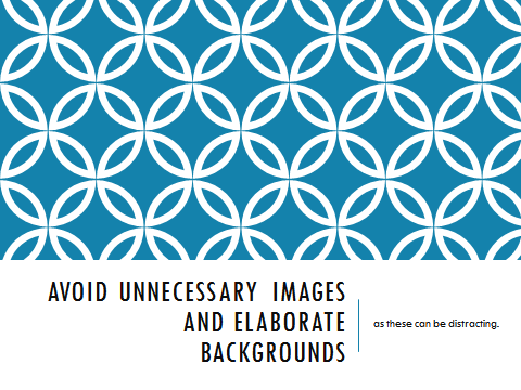
Use plain backgrounds for written material and presentation. Dyslexic students and those with visual impairments will find it very difficult to read text written over patterns or images. Even if the text is not written directly over a decorative background having a striking pattern, or moving image, on a page can be very distracting, and may prevent a student absorbing the text.
Some dyslexic students may have Meares-Irlen Syndrome or Scotopic Sensitivity Syndrome. These can cause visual distortions and make reading difficult. High contrast text, for example black text on white paper, can exacerbate this problem, because the white paper can ‘glare’ and seem so bright that it difficult to make out the text. However, individuals diagnosed with these problems will already have mechanisms or equipment to counteract these issues, such as coloured overlays or tinted glasses, and thus we should not alter the colour of the text and/ or background unless specifically asked to.
Conversely, individuals with visual impairments are likely to prefer to have a high contrast between the text and background, from black on white, white on black or even black on yellow.
Student quote:
“Don’t assume that yellow paper / background suits everyone (for me, it’s much worse than white!)”.
The simplest solution, to these conflicting demands, is to provide teaching material, in advance, in a format which enables students to edit the material to suit their own preferences and via a program which allows the content to be printed.
Colour combinations that should be avoided are red and green or blue and yellow as people with colour blindness will find it difficult to distinguish between these colours, depending upon the form of colour blindness they have.

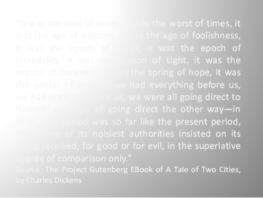
Paper
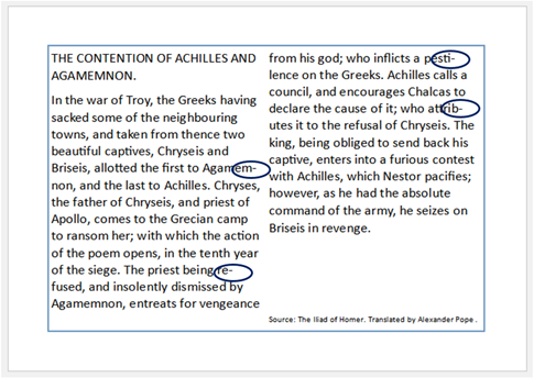
If you are providing paper copies of handouts or test papers avoid using paper which has a sheen as this can further exacerbate the visual distortions that individuals with dyslexia experience. Standard white, matt, ‘photocopy’ paper will be suitable. The image below demonstrates how some of the text on this page is obscured by the sheen on the paper.
Ilustrations, pictures, videos, physical objects.
Some content will be unavoidably inaccessible to students with limited or no sight, such as photographs, illustrations, diagrams, graphs, symbols and maps. In electronic files you can deal with this by adding Alt text or captions which can be read by screen readers (see the section entitled ‘Windows Applications and Screen Readers’ below), but in a class you will need to describe this kind of content. If you are using video material this will need to have audio descriptions if you have a student who is blind in your class.
For students with no sight there are a number of technologies that you, or they, can utilise to convey information. For example, it is possible to produce tactile maps or use plastic embossing film which rises up when written upon with a pen. A wide variety of resources can be found on the RNIB website here.
The colour of some material used in teaching cannot be changed such as works of art, maps and artefacts. In such cases the artefact will need to be described. Where the choice of colours is available to teaching staff, such as in the production or use of charts and diagrams, you will need to consider the needs of individuals who are colour blind. Colour blindness is one of the most prevalent disabilities as 8% of men and 0.5% of women will have one of the forms of colour blindness.
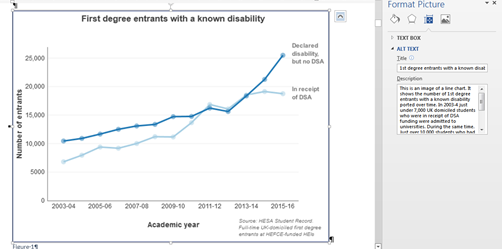
Because people with colour blindness do not see colour in the same way as the non-colour blind, try to avoid relying on colour alone to convey information. See the example below as an example.
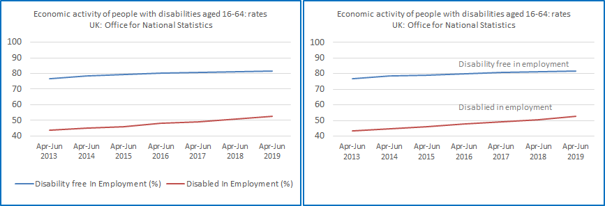
The graph in the right hand panel would be much clearer to students with a visual impairment or if they are colour blind because it does not rely on colour alone to convey information, as the data labels are presented next to the data. Alternatively we could use hatched or dotted lines to distinguish different datasets.
Equally when describing visual images, where possible, describe visual images in a way that does not refer to colour. For example, if you were to talk about the image above you could say ‘the top line’ rather than ‘the blue line’.
There are a number of free online programs that replicate the effects of the various forms of colour blindness, that you can use these to check visual images and text the suitability for colour blind audience.
Coblis, ‘the Color Blindness Simulator’ enables you to upload an image to see how it would appear to people who are colour blind. The simulator can be found here.
In the example below, I have uploaded a copy of the Streatham Campus map to Coblis.
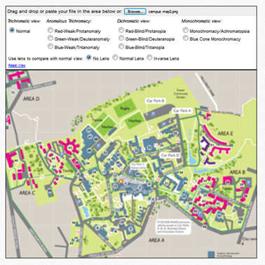
In the video below, you can see a video of Coblis scrolling through simulations of different forms of colour blindness and its effect upon the campus map (starting with normal vision then Red-Weak/Protanomaly, Green-Weak/Deuteranomaly, Blue-Weak/Tritanomaly, Red-Blind/Protanopia, Green-Blind/Deuteranopia, Blue-Blind/Tritanopia, Monochromacy/Achromatopsia and finally Blue Cone Monochromacy).
As you can see, Coblis has demonstrated that the campus map will still be intelligible to people with any of the forms of colour blindness.
This is a video scrolling through the various forms of colour blindness using the campus map that has been uploaded to Coblis.
Below you can see how colours change with the various forms of colour blindness. The video begins with the image as a non-colour blind individual would see it.
Created with Color BLIndness Simulator© 2000-2001 by Matthew Wickline and the Human-Computer Interaction Resource Network.
This is a video scrolling through the various forms of colour blindness using a bar chart containing each colour that has been uploaded to Coblis.
Sound
If producing online material, videos or presentations avoid using background music and sound effects whenever possible, as there are several groups of students who will find these distracting and students with a hearing impartment, especially those with hearing aids, may find it difficult to distinguish speech from background noise.
On-line and electronic material
Windows applications and screen readers
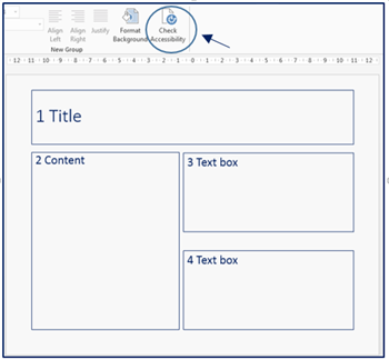
PowerPoint, in particular, can pose a problem for screen readers, because the order in which the sections of a PowerPoint side are read by a screen reader is effected by the order in which those sections are edited.
To demonstrate this see the example below. This shows a slide and I’ve added numbers to illustrate the order I want the separate sections to be read.
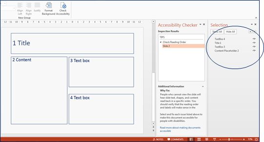
Running the accessibility checker shows me that the order in which the separate sections will be read by a screen reader. As this is different to the order that I want the sections to be read, I can correct this by dragging each item in the ‘selection’ area into the correct order.
You can perform similar checks in other Microsoft applications. Below is an example in Word.
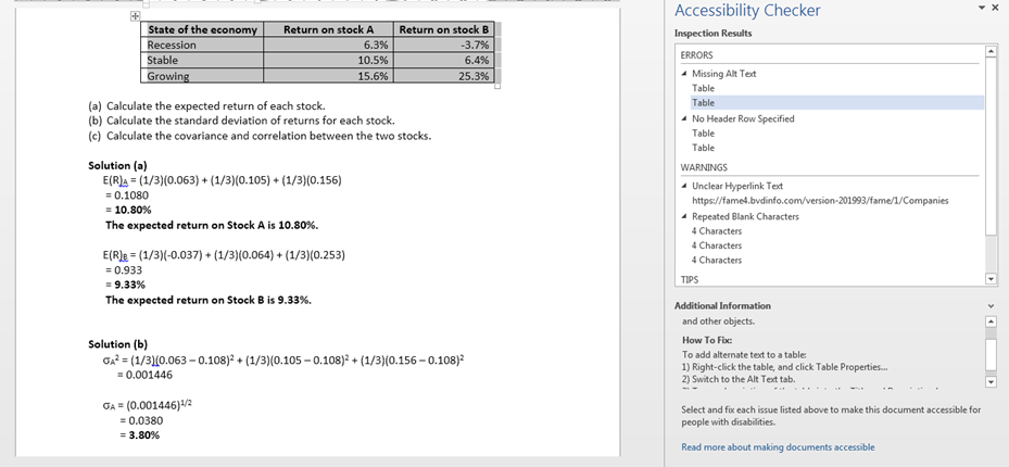
The top of the right hand panel details the accessibility issues with the material, with guidance on how to correct the issues given in the ‘How to fix’ section at the bottom 0f the panel.
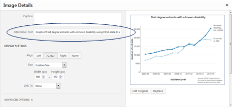
Where you include images that contain information relevant to the module, rather than being purely decorative, you need to include ‘alt text’. Alt text is a section of text describing the contents of table, or the features of a visual image. Doing this means that screen readers will read out the text and this will make the information available to students use screen readers.
The image below demonstrates the same process but for web-based images.
For images that are purely decorative add Alt text to this effect, so that students using screen readers know that they are not missing course relevant information. Where Alt text is not available use captions instead.
All web based material must follow the W3C guidelines. The World Wide Web Consortium (W3C) is international organisation that sets web standards and is headed by director Tim Berners-Lee. The following website from W3C explains what you need to do in order to make your website accessible. The link to the W3C website can be found here.
Some software such as Microsoft Publisher will, by default, add hyphens where a whole word will not fit on a line. This can make text difficult to read the dyslexic students because a word is split into two, so it will help if you disable this option.
Organisation and structure of material
Structure of course content
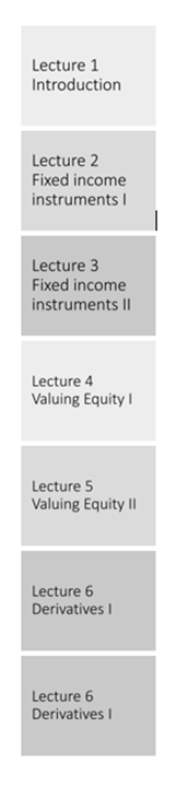
It is important to structure material in a linear form, both in the content of the material and its presentation. For example, it will be much easier for a student with dyslexia to grasp the order of lectures if the teaching material is presented as it is in example 1 (below) rather than example 2.
Although the layout below is a currently popular way to layout websites it can hinder students finding material because the order in which the material should be accessed is not clear.
To make the structure of your material clear use headings and sub-headings as this will help students navigate the material. For long documents include a table of contents.
Avoid presenting text in columns if the information covers more than one page, as this will make it difficult for people with information processing disorders to determine the order in which the text should be read.
Summary: good practice when designing written information:
Access to course materials
- Try to recommend resources that are available in both electronic and hard copy.
- Try to provide material at least 48 hours in advance.
- Use file formats that can be edited by the students to suit their own preferences.
Font and paragraph
- Use sans serif fonts such as Ariel, Calibri or Verdana. Fonts with larger spaces between letters and words are also preferable.
- Use line spacing of 1.5 and above.
- Text should be aligned left. Do not use justified text.
- Do not use multiple font styles and sizes; try to limit each page to a maximum of two font styles.
- Use at least font size 12 on hard copies of material.
- Do not capitalise entire words or sentences, or use small caps, because people with dyslexia recognise words by their shape.
- For emphasis use bold or increase the font size rather than using italics or underlining.
- Avoid elaborate or highly stylised fonts.
- Provide plenty of ‘white space’ on hard copies where the student can make notes.
Structure
- Course and module content should be structured and presented in a linear format.
- The content of handouts should be clearly laid out and structured. In addition to handouts, student may need to tape the lecture or use a laptop for note taking as dyslexic, visually and hearing impaired individuals are likely to be may be slow note takers.
- Provide handouts which replicate the slides or presentations used in the lecture.
- Use headings and sub-headings to clearly structure the material. For long documents include a table of contents
Design
- For hard copies of material avoid using paper than has a sheen; use matt white paper.
- For electronic material use black or dark blue text on a white, or off-white background. Do not use red, green or yellow text.
- Avoid combining red and green or blue and yellow.
- Avoid relying on colour alone to convey information. In charts and graphs use dotted and dashed lines or put data labels next to the data.
- Disable end of row hyphens in applications such as Microsoft Publisher
- Avoid presenting paragraphs in columns if the information covers more than one page.
- Avoid all unnecessary graphics, images and animation. Do not place text over images or back ground patterns; text must be presented on a plain background.
Electronic material
- Provide Alt text descriptions for images in electronic material and provide descriptions of physical objects and images in class.
- In videos and presentations avoid background music and sound effects to convey information and do not combine background music and speech.
Accessibility checks
- Check that images are accessible for colour-blind students using https://www.color-blindness.com/coblis-color-blindness-simulator/
- Websites should follow the World Wide Web Consortium (W3C) web standards for accessibility Https://www.w3.org/standards/webdesign/accessibility#doit
- Check documents and files for accessibility using the inbuilt accessibility checkers.