Exploring Diagnosis
Exploring Diagnosis
Posted by Daisy Elliott
18 November 2020Apologies it has been so long since blogging, the ExDx team has now largely disbanded and Ginny has been working on her latest book The Rise of Autism: Risk and Resistance in the Age of Diagnosis to be published later this month.
This two-part blog series will share with you some of the graphics that will feature in the book.
Figure 1: This figure outlines the possible links between older parenthood and autism in offspring.
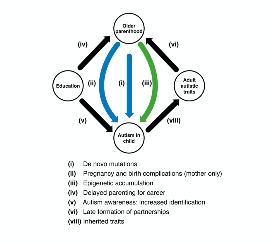
Figure 2: This data shows plotted ONS data on UK average age of motherhood over last twenty years.
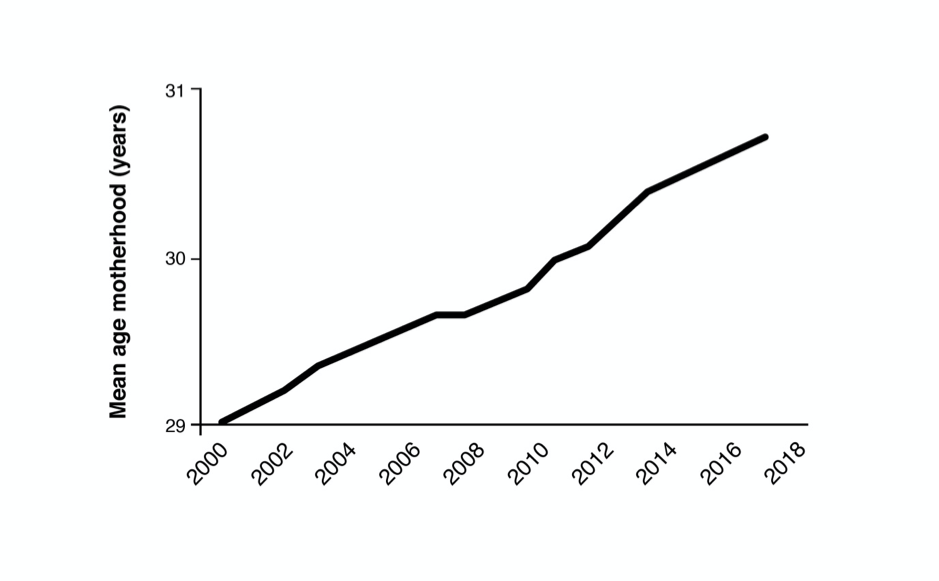
Figure 3: The below graph shows the rise in pre-term birth rates in high income regions.
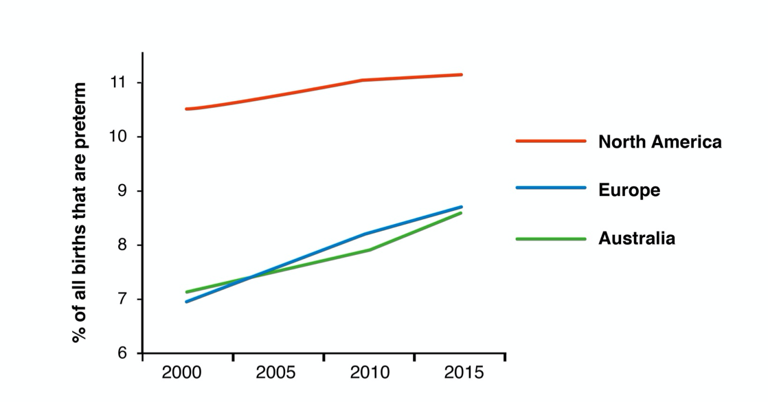
Figure 4: This graph shows the rise in “medically indicated” pre-term births, meaning those decided by doctors, versus spontaneous pre-term births in the US.
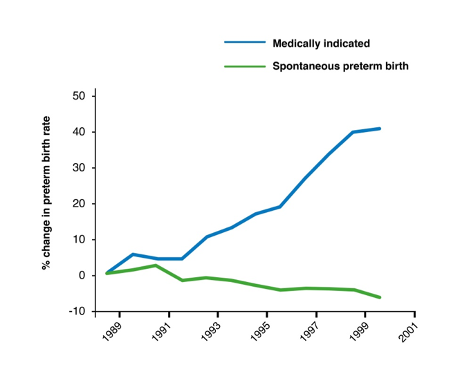
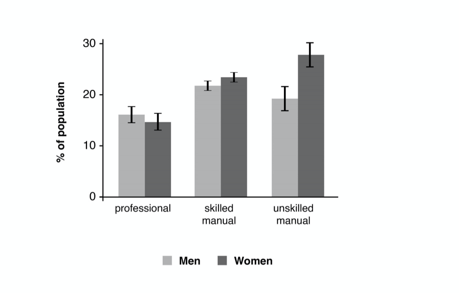
Figure 5: This graph shows interaction of obesity, wealth and gender. A thought-provoking picture of social interactions.