Katy Humberstone, PhD candidate in Languages, Cultures and Visual Studies, and first place winner in the Humanities Arts and Social Sciences (HASS) category of the Research Showcase poster competition last year, has created a guide for how to plan, prepare and present your research poster.
Below are brief snippets from the guide- the full guide is available on ELE.
- First things first, consider the programme/software you want to use
First of all, have a think about the programme or software you wish to use to create your poster. At this stage, it’s OK to have a little play around with different options – particularly if you’re not used to a particular software – and ultimately decide what’s best for you. The key is to ensure that you format your page to fit to an A0 size, as required by Doctoral College (you can easily find the dimensions of an A0 size online).
- Look out for all things design: Font and layout
I know it probably sounds obvious, but I am a strong believer that poster layout and font choices really do make a difference to the overall visual effect of your piece! It is therefore important to consider this alongside the actual content of your poster itself. Whichever structure you go for, just ensure that the piece is easy to follow, and provide arrows or other ways of directing the reader, if you think this might facilitate their engagement.
Be sure to choose a select few fonts which are easy to read (you might want to consider, for example, a font for your title and subheading-level text, and a main font for the more detailed text).
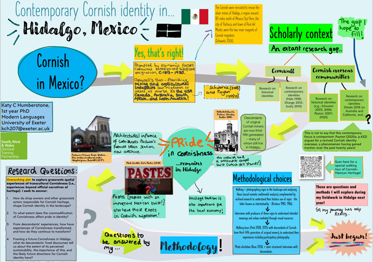
Can you spot the path-like structure in my poster?
- Text and image balance is the aim of the game
In addition to deciding on a particular shape or pattern your poster will follow (as above), it is also important to consider obtaining a balance between text and image. If you follow the ‘less is more’ rule text-wise, then you’re all set. Also be savvy about the sorts of images which you use to illustrate your points, and that any visuals/photos/graphs/symbols all help to enhance the written work rather than detract or distract from it.
- Think about your target audience and write for them
The poster competition is a particularly wonderful opportunity to explain your project to academics, students, and the broader public. You need to somehow strike a balance in your poster content so that it makes sense to someone both inside, and outside your discipline.
When drafting my Poster last year, I found it easier to take a perspective ‘from the outside’ in order to properly consider the sort of discipline-specific knowledge which I could be taking for granted and would therefore need further explanation to a broader audience.
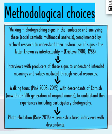
A core section of my poster (methodology), breaking-down my methodological choices
- Draft, re-draft and, yes…draft again!
Linked to my previous two tips on design and wording (yes, I did say that they were all quite interconnected!), be aware that drafting and re-drafting is a very normal (if essential) part of the poster creating process! You may find that you end up with a layout or font which does not quite work, or a text and image balance which is a little…well…imbalanced! Alternatively, you might feel, after taking a step back, that some concepts or ideas need further expansion for your audience.
- Convert to PDF every so often
While engaging in the redrafting phase, you might like to export your draft as a PDF now and again. The aim of the PDF export game is to envisage what your poster might look like once it is printed, and check for any loss of quality in images while exporting your contribution to the required format. This is important because your final submission to the Doctoral College will need to be in PDF format.
- Adding layers through the digital
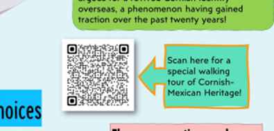
A popular choice among the submitted posters last year was to incorporate a QR code into the poster itself, to link to additional digital information about the PhD project. I created a small blog page, with a few embedded street view ‘walking tours’ of the urban landscape in Mexico which I’m focusing on for my PhD, using Google Blogger. You might also consider doing something similar with a simple blog page, or you could link to existing additional resources on the web, in order to enhance your discussion and provide an added layer of engagement. In sum, the choice is yours, and the opportunities are endless with these digital ‘layers’!
The QR code on my poster, inviting the audience to engage on a walking tour. Scan it yourself with your device to see what I created!
And…that’s it!…Now go forth and make an awesome research poster. I’m very much looking forward to seeing all your final contributions in the Forum this summer – good luck!
Handy resources referenced in this piece:
https://www.blogger.com/about/?r=1-null_user
https://www.exeter.ac.uk/research/doctoralcollege/events/research-showcase/postercompetition/
https://inkfactorystudio.com/blog/learn-visual-notes-beginners/
https://prestosketching.com/2021/01/14/a-guide-to-sketchnote-layouts/


