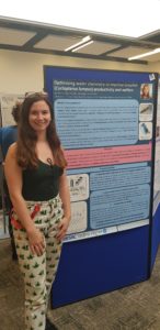
Jennifer Finlay is a second year PhD student at the Streatham Campus, University of Exeter. Jennifer completed her undergraduate MSci degree in biological sciences at the University of Aberdeen in 2018. Jennifer is currently looking to improve the production and welfare standards of lumpfish, a cleaner fish used in salmon farming, using water chemistry manipulation. Jennifer is partnered with Ocean Matters, the largest producer of lumpfish in the U.K. Jennifer enjoys public communication of her research, and thinks that it is a vital part of her degree. After completing her PhD, Jennifer would lie to work in the aquaculture industry before going on to teach.
Research posters are an effective method for presenting your research in a creative way. There are an increasing number of ways to design a poster, and the research community is starting to embrace and encourage more innovative poster designs (see below for more detail).
For those who do not yet feel comfortable presenting orally or for those who like to present their research in a less structured way than oral presentations, posters are the way to go! Poster formats are only limited by the space that you are allotted (e.g. A0 portrait or A1 landscape); the content and the way you present your poster is up to you!
Whether you are presenting your research to the public, or at an academic conference, you will likely be given a ‘poster presentation slot’- the time at which you are expected to stand by your poster, sometimes with a drink or snack in hand, and answer questions. This informal presentation format allows you to tailor the poster to the audience. With oral presentations, once you have made your presentation, there is seldom an opportunity to change the direction of your presentation as you present. With posters, however, the presentation is more of a discussion; you can gauge how much background knowledge the audience has and adjust your presentation accordingly.
What is a research poster?
Research posters are not just for researchers with data, they are also a great way to introduce your research before you have started gathering data; you can outline your proposed project direction in a creative manner and get helpful feedback from the audience. When you don’t have data, focus on the background information, the aims and objectives of your research, and any methodology which you plan to follow to get answers.
When you do have data, research posters are a great way to highlight specific results which are exciting, novel, and/or interesting. Remember, posters are summaries of results; only show the interesting and unusual as cluttered posters can look intimidating and be hard to navigate. Generally, when you have data, it is a good idea to follow: what the background is and why you are researching the topic, the aims and objectives of your research, how you performed the research, a discussion of the results, the main take away, plus what you intend to do next.
Innovative poster designs
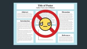
When you have set up your poster next to tens or sometimes hundreds of others, it is key that your poster stands out! So, you don’t want a poster like the one below…
This poster is clearly laid out, however, it is unlikely to capture anyone as it looks plain and there is too much text! See poster ideas below for ideas on how to capture an audience.
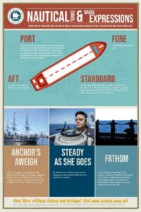
The above posters have attractive and simple colour schemes, and clear, easy to follow messages. To create an attractive and informative poster, follow these steps:
- Know your brief– what are the dimensions of your poster? Change the dimensions before you start designing the poster. See this link how to change the slide size in PowerPoint. If you are using another version of PowerPoint or another type of software, Google and YouTube will help you. For different poster dimensions, see below.
- Know your audience– if you are creating a poster for the public or people who know little about your research area, focus more on the background than data, and use plain language (no technical terms which you will have to explain over and over again). If you are looking to disseminate research results to an academic audience, make sure you have an overview (2 or 3 sentences) of the background and use the rest of the poster to show what you have done and how you did it. If you are looking to present your research to industry, a mix of the above is good; industry are likely to know some of the background, but maybe not all, and will be looking for the impacts of your research (i.e. are there economic or social implications?)
- Essential things to have on your poster include:
a) Your name, a picture of yourself, your professional email, and your home institution(s): you may not be able to stand by your poster for the whole session and so people who are interested must be able to find you either at the conference, or contact you later on.
b) Any supervisor’s and collaborator’s names and institution
c) Sponsor and funder (e.g. research funders or travel grants at the event which you are presenting) names and logos - Make the take away message the biggest thing on the page! The audience doesn’t want to have to read through the whole poster to decide whether it interests them- make the most interesting information big, bold, and colourful!!!
- Where you can, use images, graphs/charts, and tables instead of text. Large amounts of text are off putting to the reader, so keep it simple, and have relevant images to go alongside text. Make sure the images used are owned by you or are free to share.
- Font, text size, and colour is key! You want to have a simple colour scheme which is attractive but not overwhelming to the reader. Remember, not everyone has perfect vision, so make sure that key phrases and important information is clear.
Top tip: Print out different fonts, font sizes, and colours on an A4 piece of paper to see how they look from a distance. Are they clear? Do they stand out?
- If you don’t want to have references on your poster as it makes the layout cluttered, print mini versions of your posters or the highlights on an A4 piece of paper with the references on the back. Put the mini copies in a plastic sleeve and pin them to your poster board for people to take away.
- If you are working on sensitive data or research which is not quite finished yet and you don’t want people to take a picture of or post about on social media, use these signs (available from Google) on your posters:
Remember, it is not what more can you add to the poster, but what can you take away and have your poster still make sense– you cannot fit all of your research onto a poster so make sure that only relevant and interesting information and results are on there! If you are available to present your poster, make sure you are smiling to encourage people to come and talk to you about your research! There will be many posters around you, each competing for an audience. Make sure your poster has relevant content and is attractive! Feel free to bring along some additional information or props- sweets can be a good prop to capture the audience!
Written by: Jennifer Finlay
Twitter: @lumpyjenny


