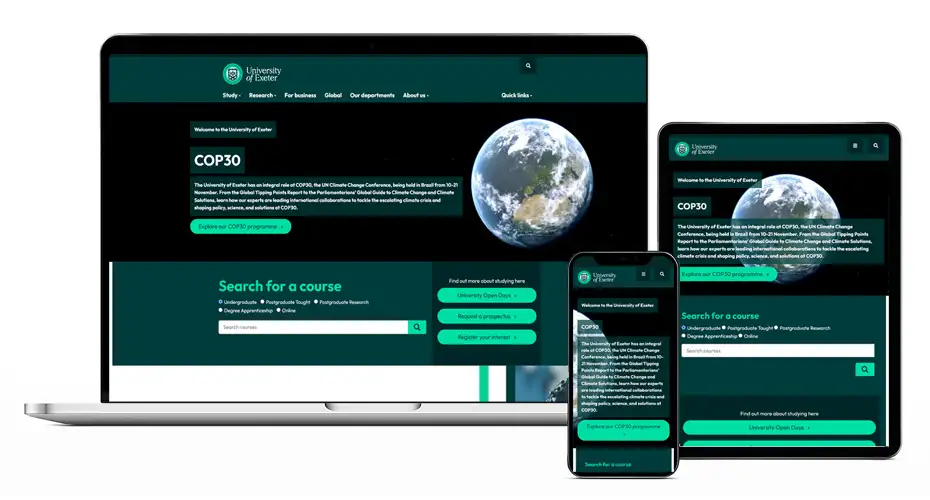
Did you know that the University website uses responsive web design? This means that the content adapts to provide optimum viewing across different devices and screen sizes.
Web visitors are increasingly using mobile devices to find information online. It varies in different parts of the site but in the study area, for example, mobile traffic makes up 45%. Therefore, it is very important that they can navigate the web content effectively.
Responsive design means that we don’t need to create multiple versions of our website for desktop, tablet and mobile – we make the one version of our content work across any sized screen.
On a desktop computer you can see how the website looks on a mobile device by shrinking your browser window. You’ll notice that under a certain width (768 pixels which emulates a tablet in portrait orientation) all the content snaps to the same width in a single column. This makes the key content easier to read on smaller devices and not too squished up.
The templates used in T4, our Web Content Management system, have been designed to adapt according the to the device they are viewed on. Therefore, it is important to use them correctly to avoid issues occurring. For instance, any images used should be resized to the standard dimensions for the university website (930×500 pixels) and embedded text should be avoided in images (apart from logos) as it is hard to read on mobile devices.
The way content is viewed online is constantly evolving so we regularly review and adapt the templates we have available. We will keep you posted about new templates available to T4 users and any changes to existing templates. Don’t forget to subscribe to the blog to receive the latest posts by email!
Read more about responsive design and find out about the T4 templates available on the Web Support pages.