

By Jack Ryan-Phillips
You might be wondering whether visitors get lost or sidetracked on the way to your webpage. One way to find out is to follow their route yourself.
As a web officer within a research team, I recently spent several weeks working out why people who wanted to develop their digital skills weren’t reaching the tool built to help them. The Digital Skills self-assessment sits behind several entry points – eg. a Google search, a link from the Library’s LibGuides page, the University’s Professional Development page, a mention in an email. Each route could lead someone to the same place, but the paths were inconsistent and it wasn’t clear how many people fell away along the way.
This post sets out the process in eight steps, so you can follow it for your own webpage or product.
1. Define the problem to solve
Before developing personas, it is useful to define the problem you are trying to solve. In this case, the challenge was both user-focused and organisational: helping people find relevant Digital Skills resources while increasing awareness and engagement with the service. Starting with this shared understanding gave greater context and purpose to the persona work that followed.
2. Start from your user personas
Before you start, decide who your audience is and how they might act. I worked from a set of personas built by UX researcher, Callum Downes, from staff research. The set covers a range of roles and motivations – a leader, a manager and a learner among them – each with their own reasons for wanting to develop digital skills and their own starting point for looking.
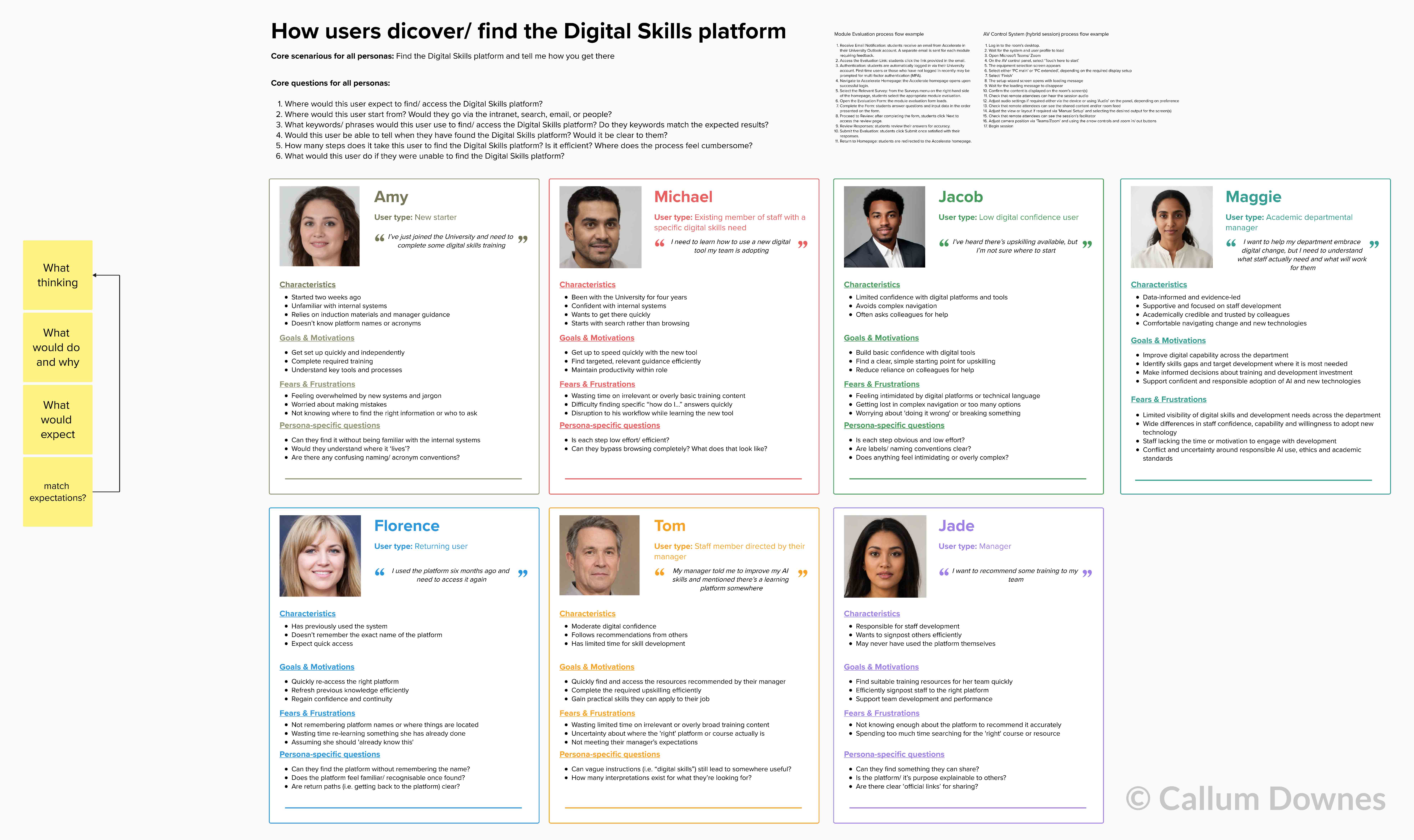
Each one gives you a specific person to walk through the journey, which keeps the rest of the process grounded in what real visitors want.
Each one gives you a specific person to walk through the journey, which keeps the rest of the process grounded in what real visitors want.
3. Walk each journey from a blank browser
For each persona, start from a blank browser (ideally with no cache, such as a private or ‘incognito’ window) and travel the full journey to your product, exactly as they might encounter it: a search term typed cold, a link followed from an email, a page found through another team’s site. Work through every entry point you know about, and any you discover on the way.
4. Record where the journey breaks down
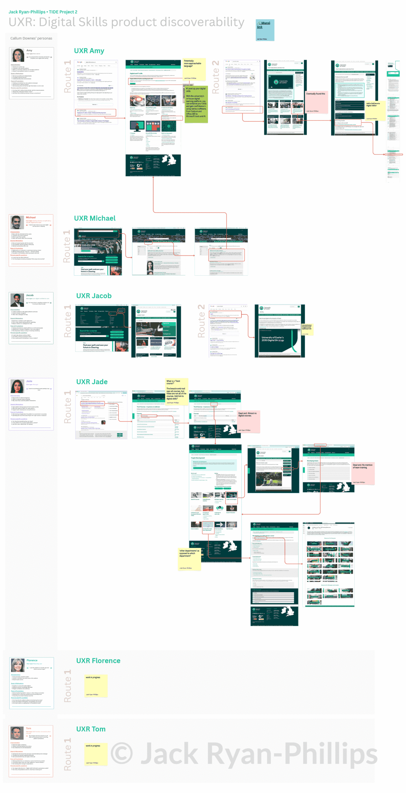
At every step, note where you landed, how many clicks it took, and whether the language on the page matched what that persona would be looking for. Set what each persona hoped to achieve against what they could achieve. My notes took the form of a map or flow diagram.
In my case the gaps were small, but they added up. Some searches surfaced two different pages for what should have been the same destination, with no clear signal about which one was ‘right’. Some pages described Digital Skills in language that made sense internally but didn’t match how staff talk about their own skills gaps. In other places the content was accurate but the next step wasn’t obvious – someone could arrive at a page and still not know what to click. These gaps came from touchpoints being built separately, at different times, with little visibility of how they connected to one another.
5. Turn the findings into suggestions
With the friction points mapped, you need to decide what to do about each one. Keep the suggestions concrete and small. Mine were tweaks to page text so the language matched user expectations, and shortcut buttons that gave people a single, obvious next step.
6. Review the suggestions with the people who own the pages
At this point, you need your stakeholders. Changes to live pages need the agreement of the people responsible for them, so take every suggestion to the project sponsors and page owners as a starting point for discussion.
Talk through what could realistically change, what the ramifications might be, and what wouldn’t work given constraints that aren’t always visible from the outside. This step shapes the outcome: some of my suggestions were adopted as they stood, others were adjusted, and a few were dropped for reasons that only became clear in the conversation.
7. Implement the agreed changes
Once you have agreement, make the changes and keep a record of exactly what changed and on which pages. That record is what you will refer back to when you assess the impact.
8. Plan how you will measure the impact
You will want to know whether the changes worked, and the obvious measure is landing page visits before and after. Two things make that comparison difficult.
The first is timing. The changes are recent, and in my case there is no data for the same months in previous years. Visitor numbers on these pages are small and rise and fall with the academic calendar, so a month-on-month comparison would reflect the time of year more than the changes themselves. A fair comparison has to be year on year, which means waiting for the same months to come round again.
The second is scale. A line of text or a shortcut button is a small intervention inside a large system with many routes through it and many other things changing at the same time, so the effect of any single tweak is hard to isolate. Even with a full year of data, a clear result is unlikely.
Keep your original test criteria in mind as well. My persona testing measured the number of clicks needed to reach the tool directly. Since then, a new central hub landing page has been introduced as an intermediate step, which that testing didn’t account for. If something similar happens on your project, note it alongside your results.
The lasting value of this process sits in the method: working from personas, walking the actual journeys, and agreeing each change with the people responsible for the pages. It is repeatable, and it is already shaping how we look at the next set of touchpoints.