the beat of our hearts
the beat of our hearts

Posted by rrov201
20 September 2021Creativity and the arts are at the heart of our project on LGBTQIA+ loneliness and belonging. In the past as well as today, those who felt like they dwelt on the margins of societal norms regarding gender and sexuality have turned to creativity to express their feelings and experiences.
And creativity has often been a way for us to find and build community with others. Sometimes it’s as if we feel we’re reaching through an artwork to the personality that created it and sensing that ‘you are not alone’.
It was really important, therefore, that the artist who would create the logo for our project was sympathetic to these values and the way the project is framing the importance of the arts for dramatizing LGBTQIA+ loneliness and belonging.
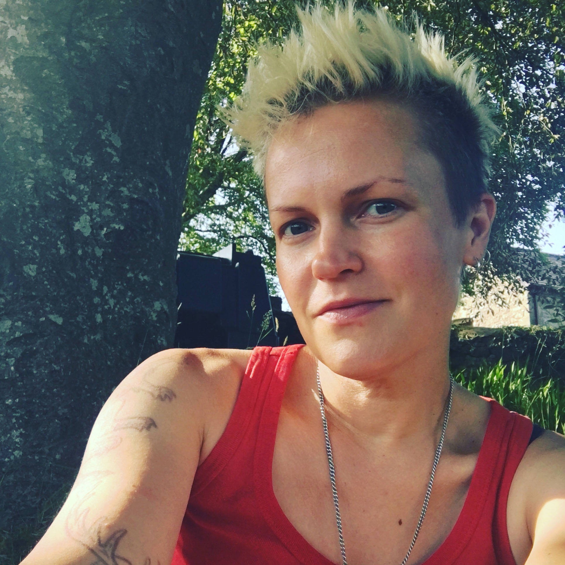
I spoke to graphic designer and illustrator, Frank Duffy, to find out more about what The Beat of Our Hearts means to them, and why they wanted to design our logo.
When I asked Frank about why they wanted to get involved, they said:
I was delighted to be asked to work on this project. As a bisexual non-binary trans person I know first-hand the importance of queer community, of finding people who can relate to you and your life.
There’s an easy sort of short-hand being around queers – there’s an acceptance and ease we can struggle to access in a cishet world. Finding community probably saved my life. So this play about LGBTQIAA+ loneliness, especially during the pandemic, couldn’t be more important to me.
Frank explains how
In about 2008 I met a group of queers all house-sharing together – there I met my first other trans person, learnt about the possibility of being non-binary, and generally came to understand myself a lot better. There were lots of zines floating about and they were generally photocopied from typewriter-typed text cut and pasted alongside drawings and photographs. There were also old copies of Spare Rib and other feminist publications, as well as art from the Guerrilla Girls. The half-tone dots of the photocopier as well as the typewriter font came from these memories, and the colours feel vivid, uncompromising and related to non-hierarchical community organising and radical politics.
For Frank, the design of our logo is connected to a history of dissident politics and attempts to challenge existing ways of seeing things. For me, this link to the past enriches the artwork and illustrates the project’s focus on histories of LGBTQIA+ belonging and loneliness as much as present experiences.
We can’t wait to explore the ways in which our project will elicit new histories of LGBTQIA+ community, isolation, and intimacy.